| | ||||
|
Tuesday, December 15, 2009
Poem Visualization
Monday, November 30, 2009
Collaborative Projects
I enjoyed both groups that presented their collaborative projects the first day. Diana and Christine's exhibit entitled The Intolerable Truth: A New Take on Consumerism was very interesting. This presentation included the artists Toni Dove and Christopher Jordan. Both of these artists were new to me and I felt they would work well in an exhibit together. They complement each other on the central theme of consumerism and the importance put on it in our society today. I really enjoyed Dove's video pieces especially because they were interactive. I especially liked the one where the voices of the characters were automated computer voices. This voice always creeped me out as a kid, so to hear that in an art piece to me makes it a bit more intense and uncomfortable. I didn't enjoy Jordan's work as much because I felt it was too literal, especially the ones of the dead birds with their stomachs filled with garbage. This almost seemed like it was beating it's audience over the head with the meaning, while Dove's left some room to think about it. These two artists worked well together though, and were definitely a good choice.
I missed the title of Sara and Nicole's presentation but it dealt with the artists Jessica Bruah and Graham Harwood. I really enjoyed Bruah's photos of the faceless people in awkward situations. Since they were faceless, it left you with more to think about and the ability to wonder who this person was. I liked that mystery about it. Both artists worked off the idea of identity which made them complement each other in the presentation quite well. Harwood was a bit more intense but still played off this concept of identity by telling stories with photos of faces. Bruah's work appealed to me more aesthetically, but there's really no reason why.
Jess and Liz's exhibit was also interesting. It was called "Interaction Required" and all of the pieces involved the viewer's interaction. Rebecca Allen's pieces were interesting because she used modern technology for the viewer to actually physically control the piece. Usman Haque's pieces were also very interesting. I really liked how the viewers voice was the main component in making these works successful. Without the viewer, the art wouldn't exist, at least the way it was intended to.
I missed the name of Kyle and Ryan's exhibit but it was all about manipulation. The artists they spoke about took finished pieces of art and manipulated them to create new pieces. Artist Lillian Schwartz combined the Mona Lisa and a self portrait of Leonardo Da Vinci because there is a theory that the Mona Lisa is also a self portrait. Cory Arcangel's work was pretty interesting too. He changed nintendo games and made them do what he wanted them to do. I always found programming crazy and can't even imagine how he tapped into these games and created what he wanted to. I also like the fact that both of these artists changed the meaning of the previous things they are working with. It leaves you with the question, what is art really worth?
Liz and Jess's exhibit was about Repetition and it included Pascal Dombis and Terry Mulligan. Dombis works with algorithms and line drawing with repetition being his biggest component. Terry Mulligan's pieces use geometric repetition so these artists were good choices to compare.
I also liked Alfred and Brian's presentation that included artists many people overlook. Both John Lasseter and John Knoll have done important things in the digital world. Lasseter created Pixar and Knoll created photoshop. I'm sure many people overlook these people as traditional artists but they deserve a lotof credit. Both have pioneered new ways of creating digital art.
Self Visualization Updated
While working on my self visualization project, I realized that I was heading in the complete wrong direction and had to turn around and retrace my steps. Some of the images remain, but the final concept is completely different. The piece ended up consisting of three pieces. On each piece were the unifying factors of the background, which was made up of different sections of walls of a house that I spent a lot of time in, crowds from all of the shows that my band has played which consist of most of my closest friends, and the main photos which I still made them have that "old" look to them. The middle piece is still of me, but on the left is the bay in Bayonne, while the right is the ocean in California. The meaning behind all of this is fairly simple. My band started in the first frame, and where I want it to go is the last frame. We all want to be the first band in Bayonne to get out, and that's what I am trying to show here. The house is significant because I have done most of my growing up here since high school. It was like our clubhouse and a place we could always go. It was recently sold and I probably won't be able to step foot in there again. This direction was easier to approach and see and I'm glad I went with something that was more comfortable to me than trying to create something I didn't really know.
Tuesday, November 17, 2009
Book
For my final book project I was thinking about using Edgar Allan Poe's "Annabel Lee." In this poem, a man is very in love. The gods are jealous of their love so they decided to kill her and steal her away from him. Now, even though she has passed he still sits and lays at her tomb every night to be as close as he can with her. I chose this poem because it had very obvious visual components and I thought I would enjoy creating the imagery for it. Right now, I'm thinking of making a book shaped as Annabel Lee's headstone or something like that. Other than that I haven't had many ideas yet.
Monday, November 16, 2009
Distortions
I really enjoyed the gallery exhibit entitled Distortions: Contemporary Art From Mexico. I felt like this was one of the first times that I've been to an exhibit where everything in it worked together this well. Each piece was very unique, but when they're viewed side by side there is an added effect of unification, especially since they are all making statements about their culture and where they live. It was also very difficult to pick one artist and piece who was my favorite. If i had to, I think I would have to choose Gilberto Esparza's "Urban Parasites." I love the fact that when you walk into the room, all you see is this heap of garbage, but all of a sudden you notice movement all around it. I think the creation of these things are amazing. I have always been fascinated by robotics. The most interesting part about this piece is that they are all found objects. I really wish I could see the parts of this series in Mexico that ride the power lines. I loved this idea and I loved watching it.
Tuesday, October 27, 2009
Self Visualization
I don't think that I have ever thought so hard about an idea for a project in my life. I had a few different ideas in my head, but there is one I am leaning towards. Lately, I have been thinking a lot about the 1950's and how simple the times were. There wasn't much to do, there wasn't much technology, and there wasn't much variety. I often wonder what it would have been like to be a teenager during this time. Along with thinking about this, I have been listening to a band that are all in their late twenties, but write lyrics as if they grew up then. In my photos I'm wearing a simple white t-shirt and blue jeans. No logos, no gimmicks. I wonder if this simplicity would be a good thing. I always hear members of this generation saying "Those were the days." But were they?
That's how I came up with the idea to explore this scenario, and place myself into an era by aging the photographs. I also want to scan actual old photographs and use them as a background. Then, I came up with the sink or swim idea. Again, tying in with the same band, it has been a thought stuck in my head for quite some time. It's the simplest answer to life; you can either sink, or swim. It also ties in with where I live and grew up, surrounded by water. These ideas are very different but I feel like somehow I can connect them. Who knows.
That's how I came up with the idea to explore this scenario, and place myself into an era by aging the photographs. I also want to scan actual old photographs and use them as a background. Then, I came up with the sink or swim idea. Again, tying in with the same band, it has been a thought stuck in my head for quite some time. It's the simplest answer to life; you can either sink, or swim. It also ties in with where I live and grew up, surrounded by water. These ideas are very different but I feel like somehow I can connect them. Who knows.
Monday, October 19, 2009
Artist comparison

When looking through the different work of these three artist there is an obvious common link between them: femininity. Each one of them expresses different aspects of the female form in their work. Cui Xiuwen's work was quite depressing. The sharpness of the images and the white made everything seem very cold and depressing. Of course the subject of maternity comes about and adds even more impact to the aspect of isolation. This artist's work is very different from the the other artist's because her subject seems fragile and alone, while the other artist's subjects have a certain sense of independence and confidence. Xiuwen's pieces are quite sad and they make you wonder what the outcome of the story was.
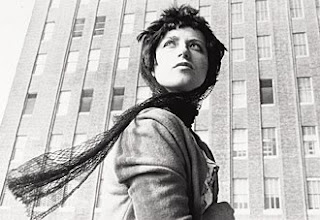 I have enjoyed looking at Cindy Sherman's because they have a very film noir look to them which i have always loved. Her pieces are different from the others because they portray a confidence in her subjects as women, but in more of a sexual way. Her subjects seem more like sex symbols than anything which is very important to how the work is interpreted. It embodies a confidence in female sexuality, the body, and power. They are also done in a classy way combining both status and sex. Personally, I enjoy these photographs merely for the way they are composed, but their purpose only makes them stronger.
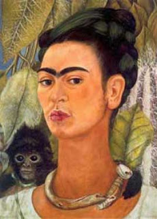
Frida Kahlo's images, though similar to Sherman's in the sense of confidence, are executed very differently. Her images have a certain sense of elegance and sophistication that did not match the other artists. A major reason for this could simply have been the times it was made. The other two artists created their images long after Khalo did and it would be interesting to see what she would do now. Kahlo's images also tie in the aspect of culture, which all three artists do well. Xiuwen shows aspects of Asian culture, Sherman shows American, and Kahlo's shows Mexican. Her images convey a message of strength that I feel is stronger than the other images.
Monday, October 5, 2009
Tuesday, September 29, 2009
Monday, September 28, 2009
Monday, September 7, 2009
Monday, August 31, 2009
Artist Observations
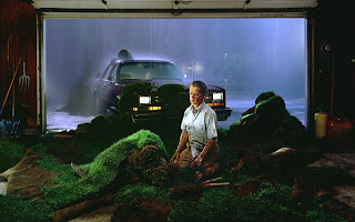
Gregory Crewdson has been an artist that I have admired since high school. The images he creates depicts suburbia in strange ways that most would never imagine. Most people see suburbia as simple, dull, and boring, but these photos are far from that. The thing that attracts me most to his photos is the quality of the prints. They almost look too real, if that is even possible. The only thing that I can't relate to is his process behind it. These photos are all staged and set up perfectly, which takes much more time than the actual act of opening and closing the shutter. I have a lot of respect for the work that goes into it because I simply would not have the patience for all the work beforehand. Crewdson definitely has some bizarre thoughts, but they transfer into great pieces.
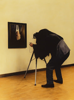
Teun Hocks' work was not my favorite. I enjoyed the ideas of them, but they are very repetitive. I don't really like the fact that the subject matter is always the same, which I would assume is the artist. I do like though the fact that the subject just happens to be on a background that looks painted. His pieces are more fantasies that are even more inconceivable than Crewdson's work. Though I do appreciate the ideas and the backgrounds, the main subject does get old to look at.
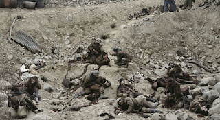
I really enjoy Jeff Wall's work. He is another artist that I researched in high school whose images always stuck with me. Wall's work is very complicated and there is a lot to look at. Even his straight photography is very detailed and his digital work is extremely interesting. You can sit and examine his piece "Dead Troops Talk" forever and you'll always find something new. Once again, I cannot even comprehend having the patience to set up and work with all the people that it takes to accomplish a work like this.
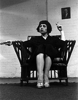
Cindy Sherman's black and whit photos were very different from those of the other three artists. I do appreciate black and white photography. I feel like the art of black and white photography is fading and shouldn't be over looked. Her photos capture the glamor of women in the late seventies and early eighties, and they do so very well. Her compositions almost seem like snap shots, but you know she had more in mind when framing them up. I enjoyed looking through these and I wish black and white photography was more prominent in schools and art today.
Tuesday, August 25, 2009
About Me
Jared Hart
Digital Imaging I
Sophomore
Art Education Major
Hailing from Bayonne, New Jersey.
Some experience with Mac/Photoshop/Illustrator
Digital Imaging I
Sophomore
Art Education Major
Hailing from Bayonne, New Jersey.
Some experience with Mac/Photoshop/Illustrator
Subscribe to:
Comments (Atom)


